
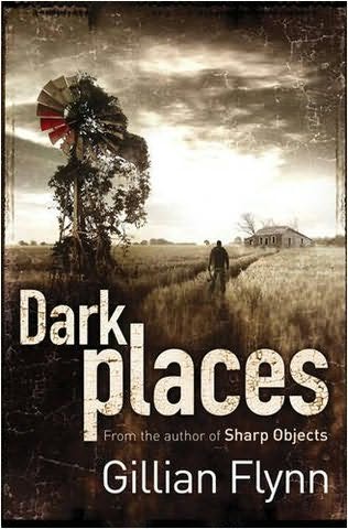
The font used here is sepia toned, and in full caps it is not all one solid colour, it is a blend of whit and brown and has an aged affect; it is in thin letter italic lettering. It is a creepy and eerie looking cover.
This also uses a white and brown sepia filter to give the same aged effect, but this one does not have the same fading mould effect and uses a bold thicker font; this makes it seem stronger and gives off a more stable and protective feel rather than the creepy and eerie feel of the first.

This uses the same bold, thicker font as the previous one, but does not use the same sepia tone. In this they use a scattered and mix mash group of colours. This is the style i will use as it is the most unstable looking and disconnected.
No comments:
Post a Comment